
How Colour Choices in Tile and Stone Shape the Mood of Your Space
DESIGN IDEAS
One mood board, in moss green and natural oak, and what makes it feel calm.
Colour choices in tile and stone set the mood of a room first, and they are the hardest to judge from a small sample. At our Winnipeg showroom I start by asking how you want the room to feel. This board pairs real products for a warm, earthy bathroom renovation or kitchen. Look at the pieces together, then read why they work.
Mood board
Olive and Natural Oak
Earthy, grounded and quietly warm.

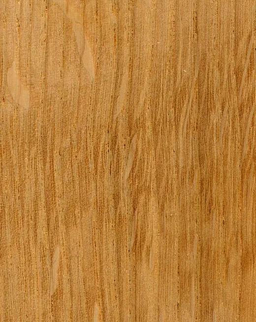
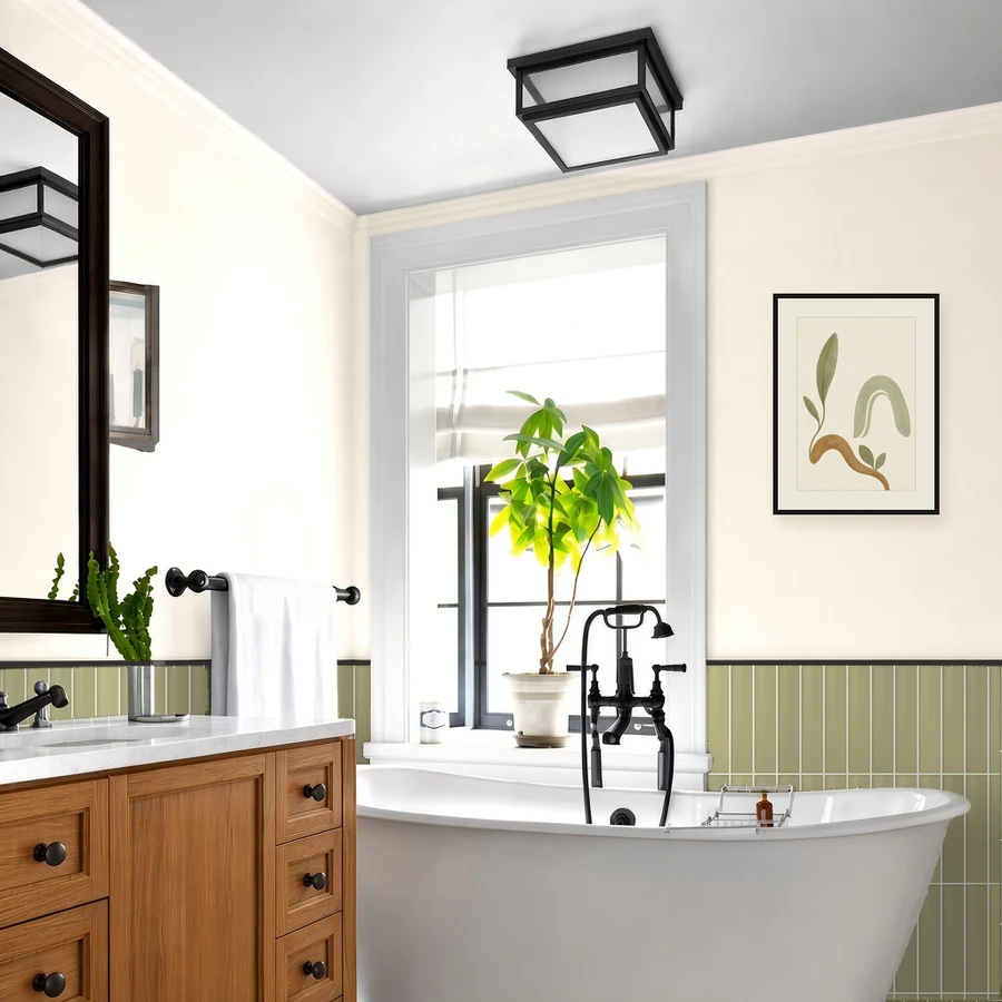

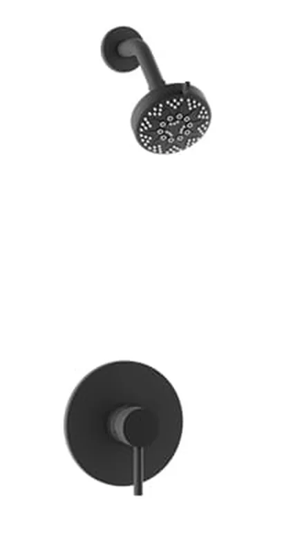
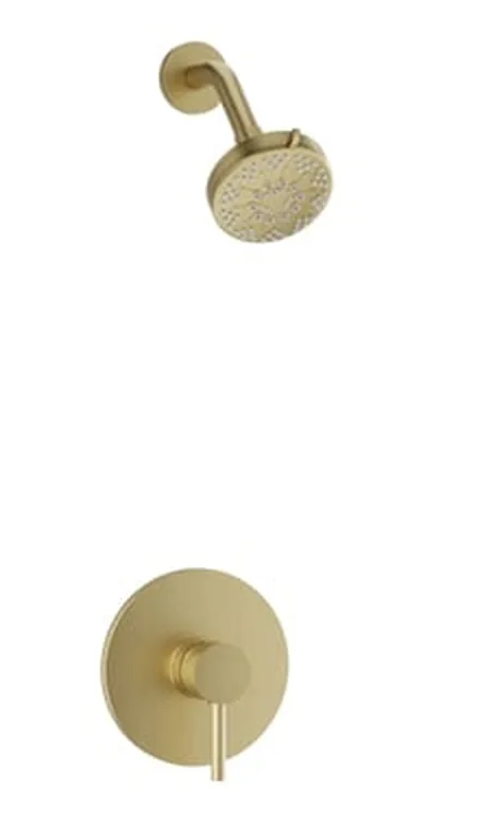
Layer them, then live with them for a week.
Hang samples at different heights and see which ones keep talking to each other.
Moss, honey oak and linen all lean warm, so the green reads as natural, not cold. Linen walls and soft Alabaster grout lift the mid-tone tile. Matte black adds crisp contrast, while satin brass leans warm and aged.
Photos and hex values are approximate on screen. The grout swatch is drawn from Mapei’s chip colour, and the room is an illustrative render. Confirm with real samples.
Why Colour Affects Mood
Every colour carries a feeling. Warm neutrals feel cozy, greens drawn from nature feel restful, cool greys feel clean and very dark tones feel dramatic. Three things decide how a colour reads in your home.
Undertone
Almost every colour has a warm (yellow) or cool (blue) undertone. Moss leans yellow, so it sits comfortably beside linen, oak and brass. When undertones clash, a room feels a little off even if you cannot say why.
Light
Colour is how a surface reflects light. Cool north light makes green look greyer, so warm linen walls help. South light shows moss’s yellow side. Check samples in your own room, morning and evening.
Finish
Matte surfaces look soft and quiet. Glossy ones reflect light, and the shade shifts as you move. Metals follow the same rule: matte black is crisp, while satin brass is warm.
A mismatch in undertone is what makes a room feel a little off.
Using Memory, Moss in Your Space
The glossy glaze reflects light, which helps a small room feel brighter. Soft variation in tone gives the wall a handmade, artisan feel. View several tiles together when you choose. Set it against the oak and linen first, then add the metal finish last, so each piece has room to work.
Mapei Ultracolor Plus FA grout in Alabaster outlines each narrow tile with a soft, light line, a little darker than the linen walls. Ivory is the alternate: warmer and deeper, it blends into the tile and echoes the oak.
The slim 2 x 10 in format suits walls, kitchen backsplashes and shower walls. I would keep it on walls, not floors, and leave the setting to our tile installation team. Browse the Memory series in our collections.
Use This Mood in Your Home
Start with the tile, then add linen, oak and one metal finish. Set a sample of Capri · Memory, Moss beside your paint and cabinets and view it at different times of day. Please book a 1 on 1 showroom consult and we can look at samples together. Visits are Tuesday to Saturday, 10 to noon and 1 to 4.
Book a 1 on 1 showroom consultJulie Cote, Torino Tile & Stone | torinotile.com